My First Portfolio
The Importance of Personality and a Point of View in a Creative Industry Brand
Four hard drives later, and I've managed to piece together 90% of the first illustration portfolio I took to market back in 2008. This all started during a recent conversation with a close friend and fellow illustrator, danny allison illustration, who shared a studio with me during this time.
We both found ourselves at something of a creativity crossroads recently. Both with two children, and still sustaining ourselves from a mixture of work across various artistic disciplines in a wildly changed world. We have changed. Some of those changes for the better, some for the worse. We reminded each other of the edge in our work back in those early days.
We inspired and motivated each other at a time when we were fired up but also fragile. Danny was two years into the game, I had a maiden portfolio and no clients, so the work was comprised of mocked-up editorial articles (in the absence of any actual industry experience), and social commentary – some clumsy and crass, some closer to clever – but all with edge and a point of view.
Today, I have 18 years of experience and many impressive client names, but at times, I feel some of that early intent and zest are missing. I'd never censor myself, but we change with age, and the gallows humour that got me on the map now lives largely in my writing. Maybe there'll come a time when I once more get political in my art, sillier again, but as a storyteller using different disciplines, I don't want to force something that was the product of a passionate twenty-something-year-old. It has to be felt, and you'll see below just how much I was feeling about the world around me, from the 2008 financial crash, to the climate crisis, and Crufts dog show.
So I'm going to share it in the hope it might help others tune into their own voice, to use their internal spirit to forge their brand of creativity, not the external, the dispiriting sameness of tend-based work.
1. 'Credit Crunch'
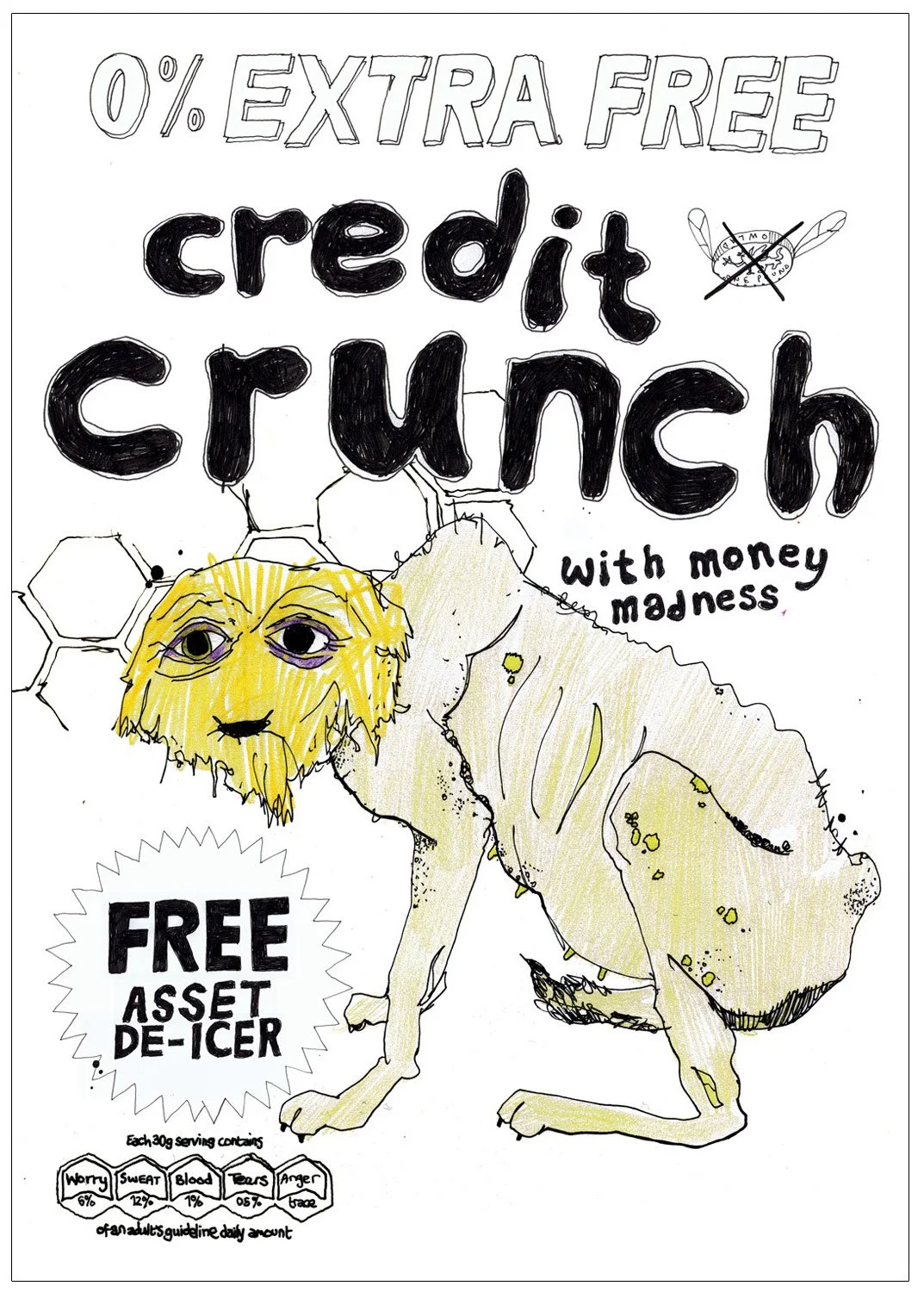
Just look at that puckered mouth, those ribs, and that tail. My drawing would improve dramatically, but the naivety and the presence of the human hand somehow worked. While clichéd – the cereal-box take on the financial crash was far from original – this had personality and a playfulness that endeared me to art directors looking for soul in a style, not just aesthetic beauty.
2. Shame Game
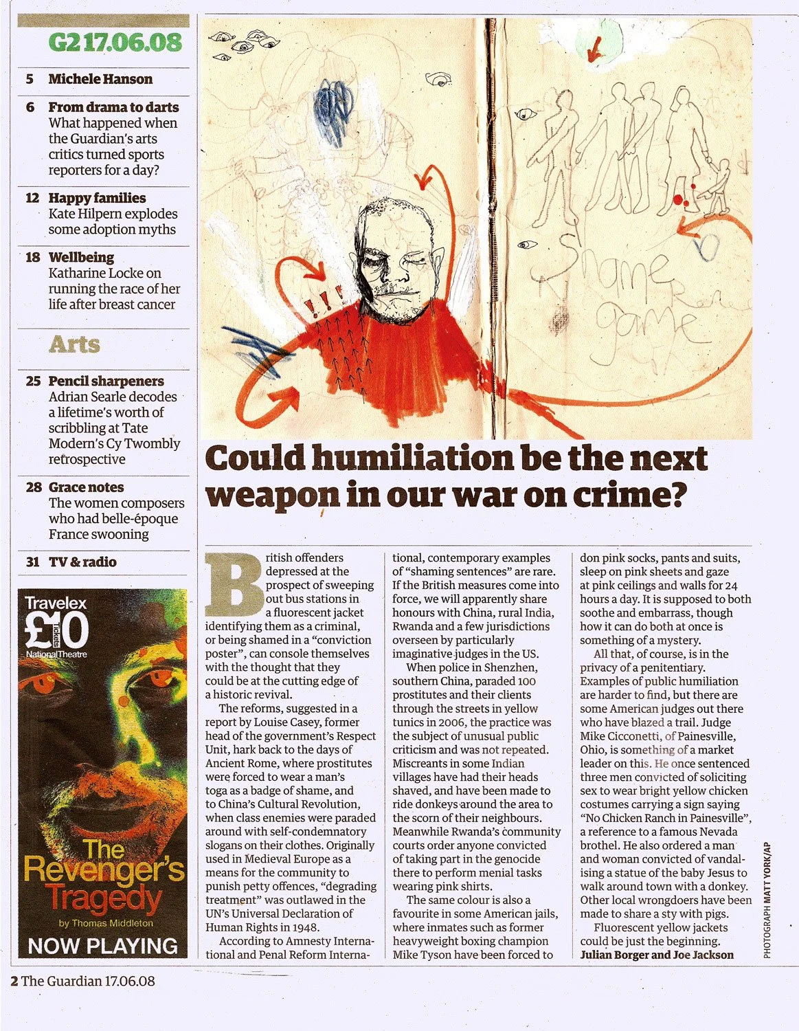
A mocked-up editorial illustration for The Guardian. Then Design Director Roger Browning had to weather my early harassment of a newspaper I'd convinced myself I'd be published in. My choice of mocked-up articles showed self-awareness – I would select topics that made me feel something, that would benefit from the edge in my hand-drawn illustrations. This, copied with the social commentary, was something Roger was drawn to in a coffee-and-portfolio browse meeting in London, and the reason he later gave me a crucial early break illustrating the cover of the Film and Music section of The Guardian. I couldn't find the football mock-ups I made to send to sporting publications, including my debut client When Saturday Comes magazineDoug Cheeseman, but these, plus my ability to work fast and under pressure, saw Roger recommend me to the Sports desk people, who would give me regular work for several years.
3. Silly Fucking Humans
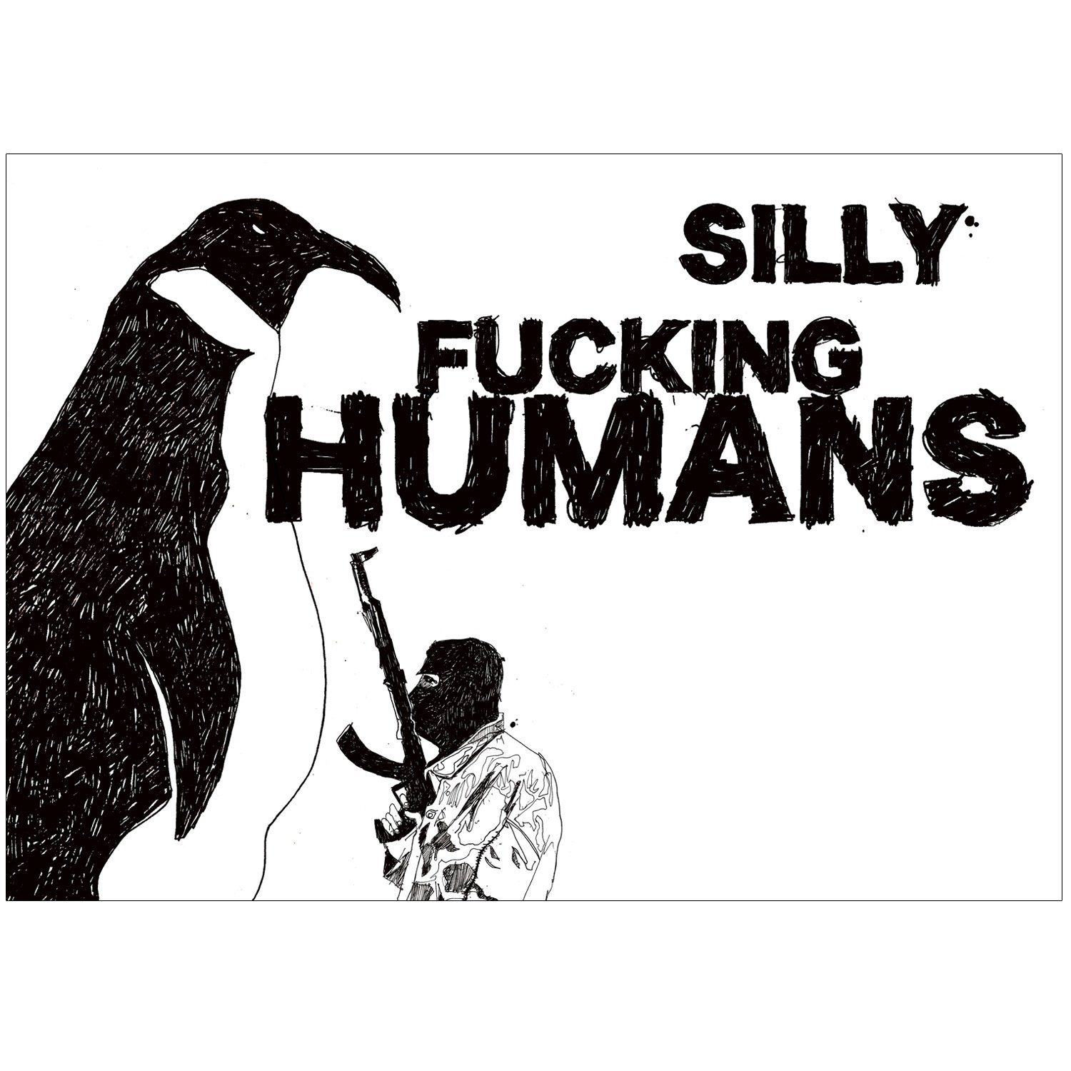
Bizarre and brutal. Not my finest hour when it came to 'activism' or 'commentary', but an emotional lash out at humanity, which I found myself loathing as I learned more about the problems we were causing ourselves along with the rest of the natural world. With a gun to my head, I couldn't break down the thinking behind this one for you, but I took pleasure in the black-and-white, graphic treatment and the way the subversive, unsettling quality seemed to get people nodding, expressing a similar dismay. It left viewers with nowhere to hide. At 25, I never second-guessed myself for including it in my portfolio, with wind in my sails thanks to Banksy, Ken Garland, Blek Le Rat, and Stefan Sagmeister's courageous work. I often wonder whether I would have dared to be so brazen, had I been 25 today. I'm sure many censor themselves, and to me, that's a shame. I work with coaching clients to help them find the authenticity to find the balance of personal voice and good intentions, because now is the time artists should be standing up for a better future, albeit with a little more consideration than this piece. As artists, we have a voice. Most good agency owners I've met yearn for personality, story, and soul in the portfolios of the people they want to hire. This weirdness would generate deeper connections with the people who viewed the work, getting us past small talk. It was different and memorable.
4. All Creatures Pale and Bald
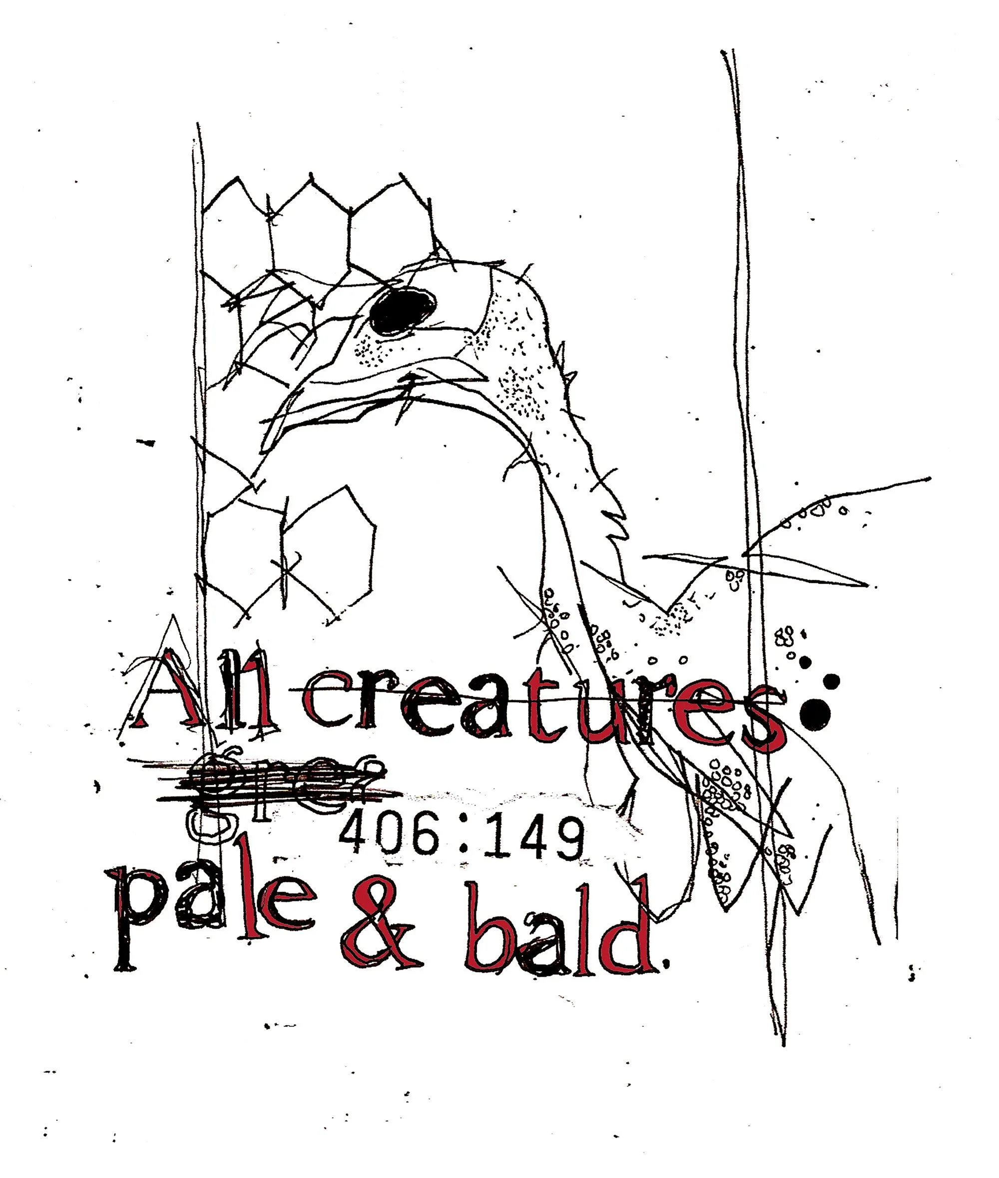
I was on a train from London to Preston when I peeked through the gap between the seats in front of me. An old lady, dripping in religious bling, reading a Bible, watched an innocent fly land on the table in front of her, and without any obvious conscious awareness of the irony, crushed the poor thing with an open palm. I felt so much anger. 'All creatures great and small' came to mind as I wrestled with more misanthropy. I smashed this unsavoury incident together with the sadness of battery farming and created 'All Creatures Pale and Bald.'
5. Ebayphant
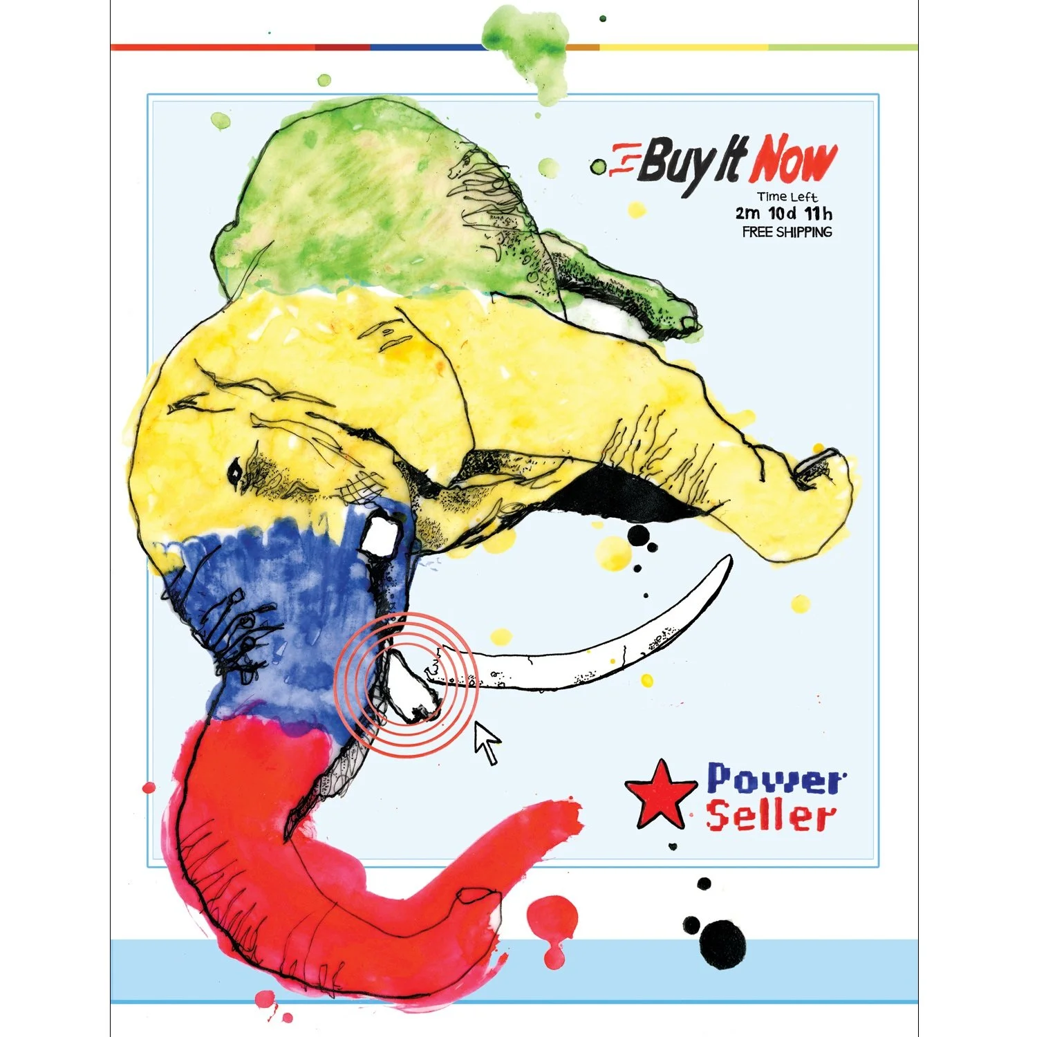
See above, except Ebay were being challenged for not cracking down on sellers dealing in ivory on their auction site. A rare attempt at full colour. Technically poor, message obvious and underwhelming, but another emotional expression of a desire to contribute to meaningful causes. I was never a perfectionist, and my willingness to share my work early and often accelerated my career by helping me connect with others and gain valuable feedback.
6. Season’s Beatings
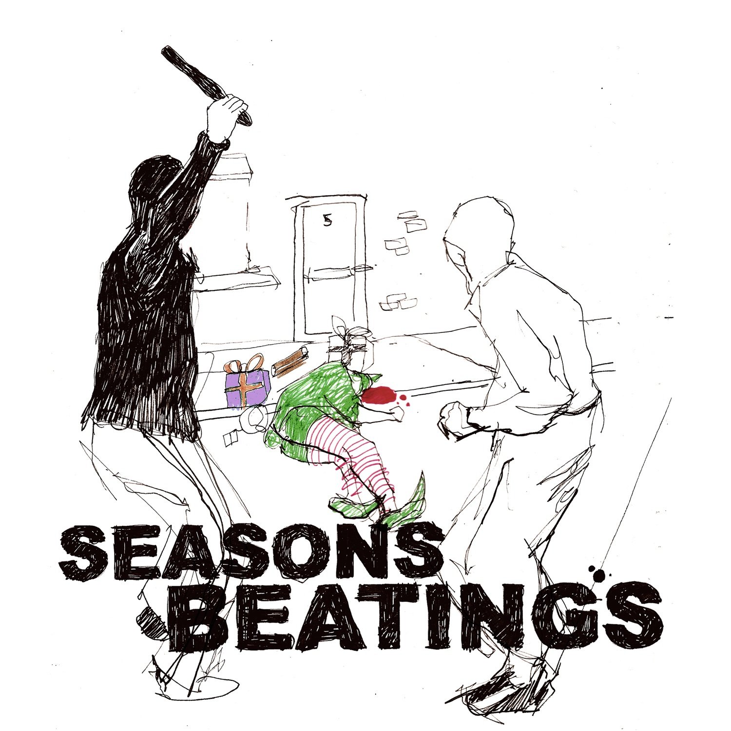
A Christmas 2008 card design I sent out to prospective clients. Unbelievable. I lived in Preston at the time, where there'd been a string of unprovoked attacks on people walking home. A little older and wiser, I now see this was a mishandled, well-meaning attempt at social commentary. The drawing was poor, and it was unnecessarily graphic without adding anything positive to the conversation. Today, I'd have gone the route of interviewing people doing great work for young people who've had tough starts, such as my podcast with Bikestormz founders Mac Ferrari and Jake100, or writing a short story, but back then, drawing was all I had, and I wasn't always going to get it right. That said, I had wonderful feedback from recipients for raising the topic and not shying away from the severity of the situation. Still... ah, my younger self.
7. Being Watched
All I remember about this is being delighted by the expressive and layered line work on the left side, that it was a pink sunset outside, and that Radiohead's In Rainbows added to a very lucid and trippy mood during a late-night at the studio, feeling very excited about my creative future. The rest is one for the psychologists to peck at. I still like this, but it falls short of my drawing ability today.
8. Tallon v Allison (birth of the versus series)

One of the biggest motivators during these formative days was my close bond with Danny Allison. Our humour was equally irreverent, and we were desperate to carve out our own artist voice. But we didn't doubt anything that made us laugh. In my time as a creative coach, I've come to recognise that a high percentage of artists overlook or underestimate their sense of humour. It need not be as base as ours was/is - humour assumes infinite forms, from the way a line is drawn, the tone of a song, or a colour selected, through to a full-on Mr Bingo cock and balls. It all counts, and in the age of AI, utilising your blend will become more valuable than ever before. This was a nod to the old-style boxing and wrestling posters I loved, and the healthy competition between Danny and me that spurred on our development and artistic bravery.
9. Gis a Job (my first business card)
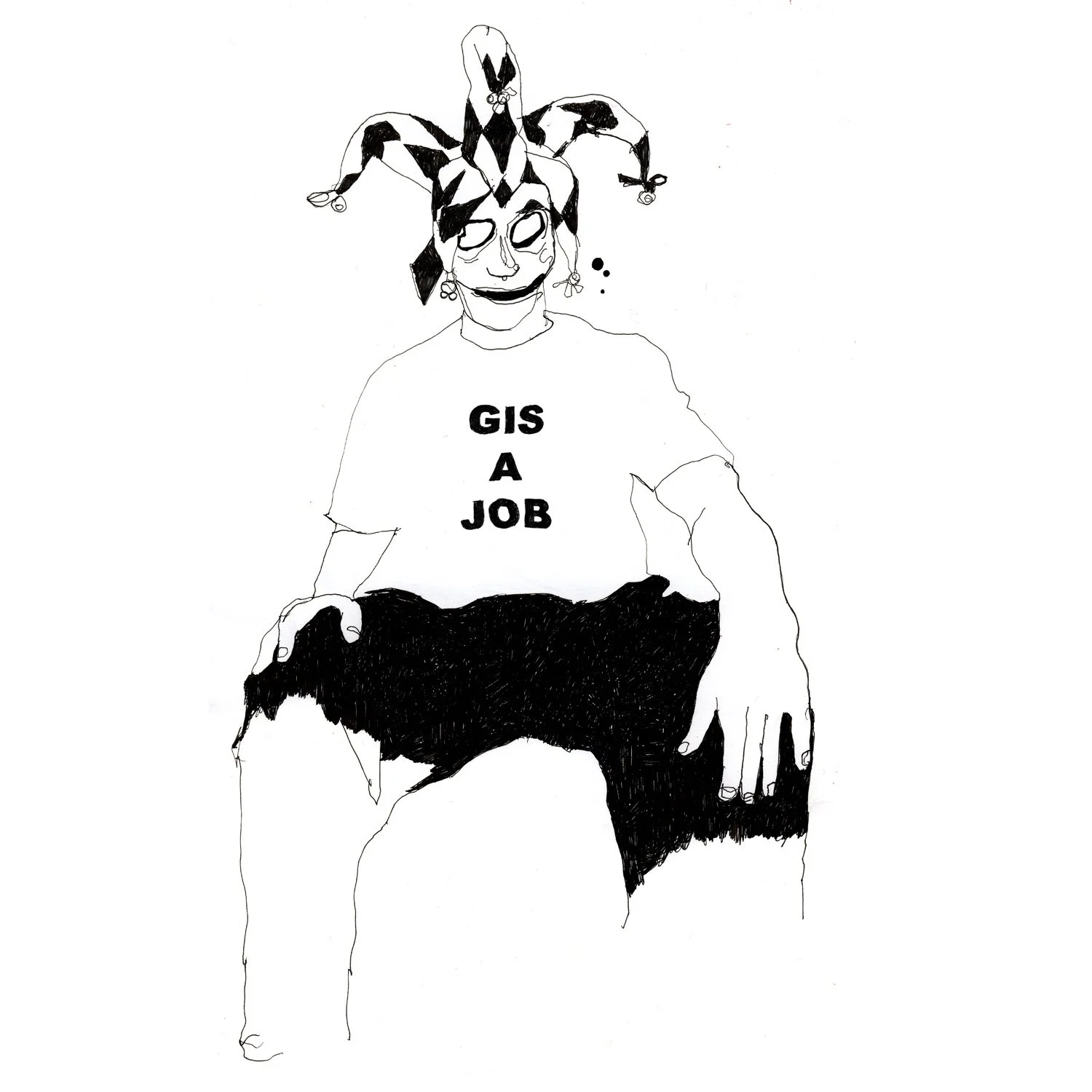
I've never taken myself seriously. Perhaps this is some damaging core belief, but it opened up the space for irreverence and flippancy when it came to making key decisions, such as marketing, presentation, or communications. This stood out and communicated the playful energy that helped me stand out, to circumnavigate fleeting market trends.
10. Tyson v Thatcher (The climax of ‘The Versus Series’)
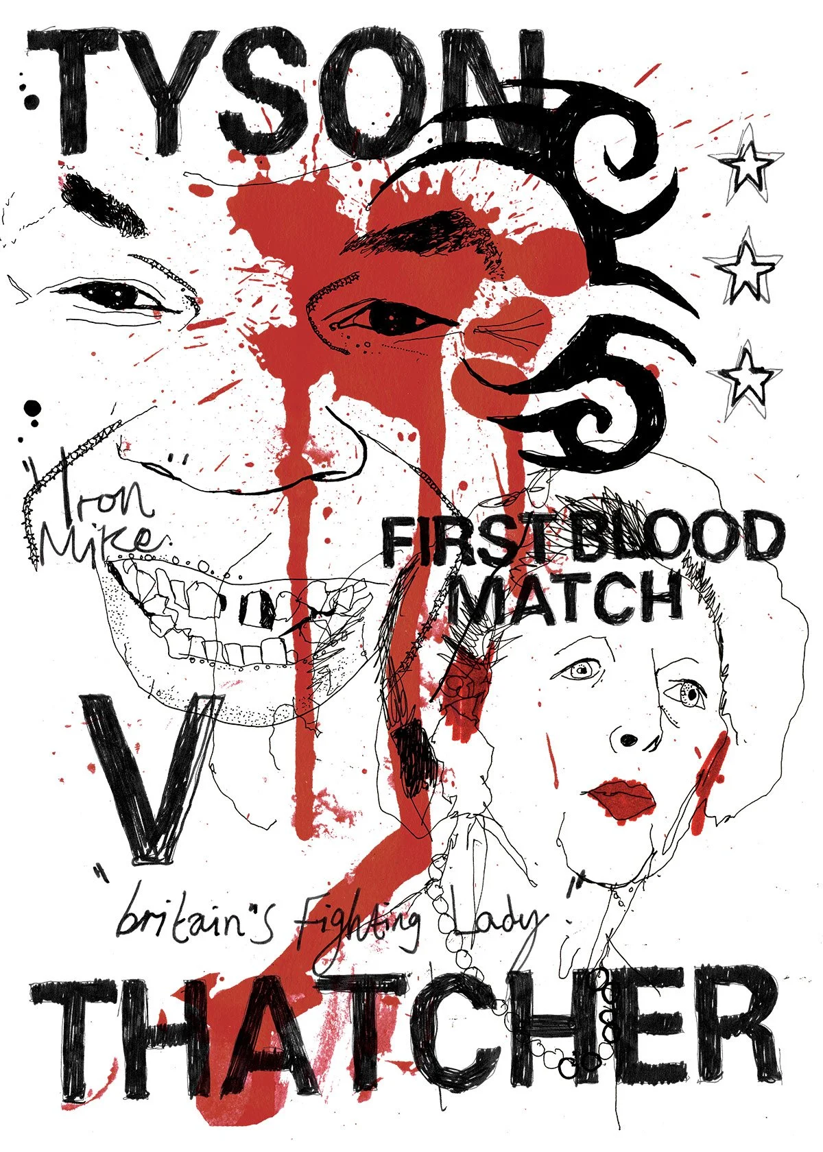
This series earned me some positive press in Computer Arts magazine, where a Channel 4 director saw Tyson v Thatcher. It made him laugh so much that he sought me out at a group exhibition in London and shortly after, commissioned me to work on TV trailers for their hit show Skins. This was a big step outside of editorial illustration which was my main income in those formative years, and helped me think bigger and broader. A leading example of why the personal, even when utterly outrageous and raw, transcends commercial work in attracting the best aligned opportunities.
11. Polar Bear
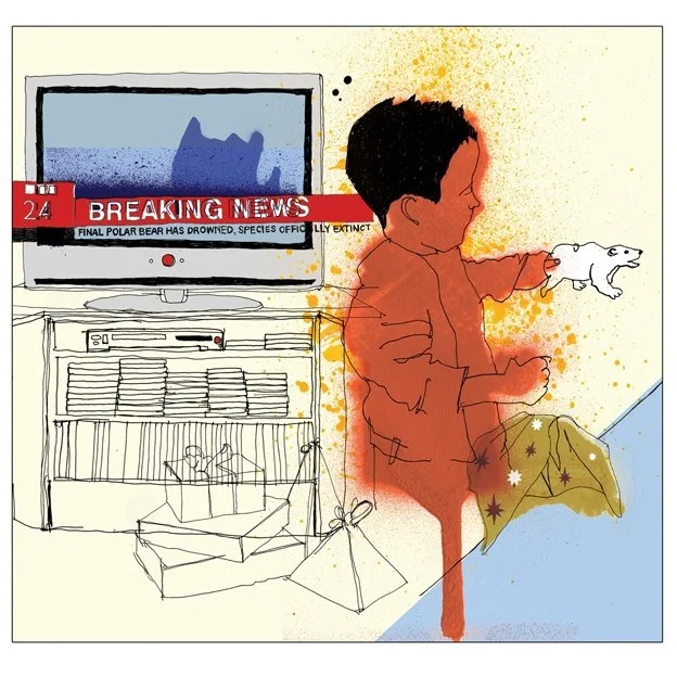
Another piece motivated by the sadness and anger I felt over environmental destruction by humanity, this time specifically about the wasteful use of resources and the irony in the nature of some children’s toys and stories. Growing in confidence with colour use here.
12. The Feral Five
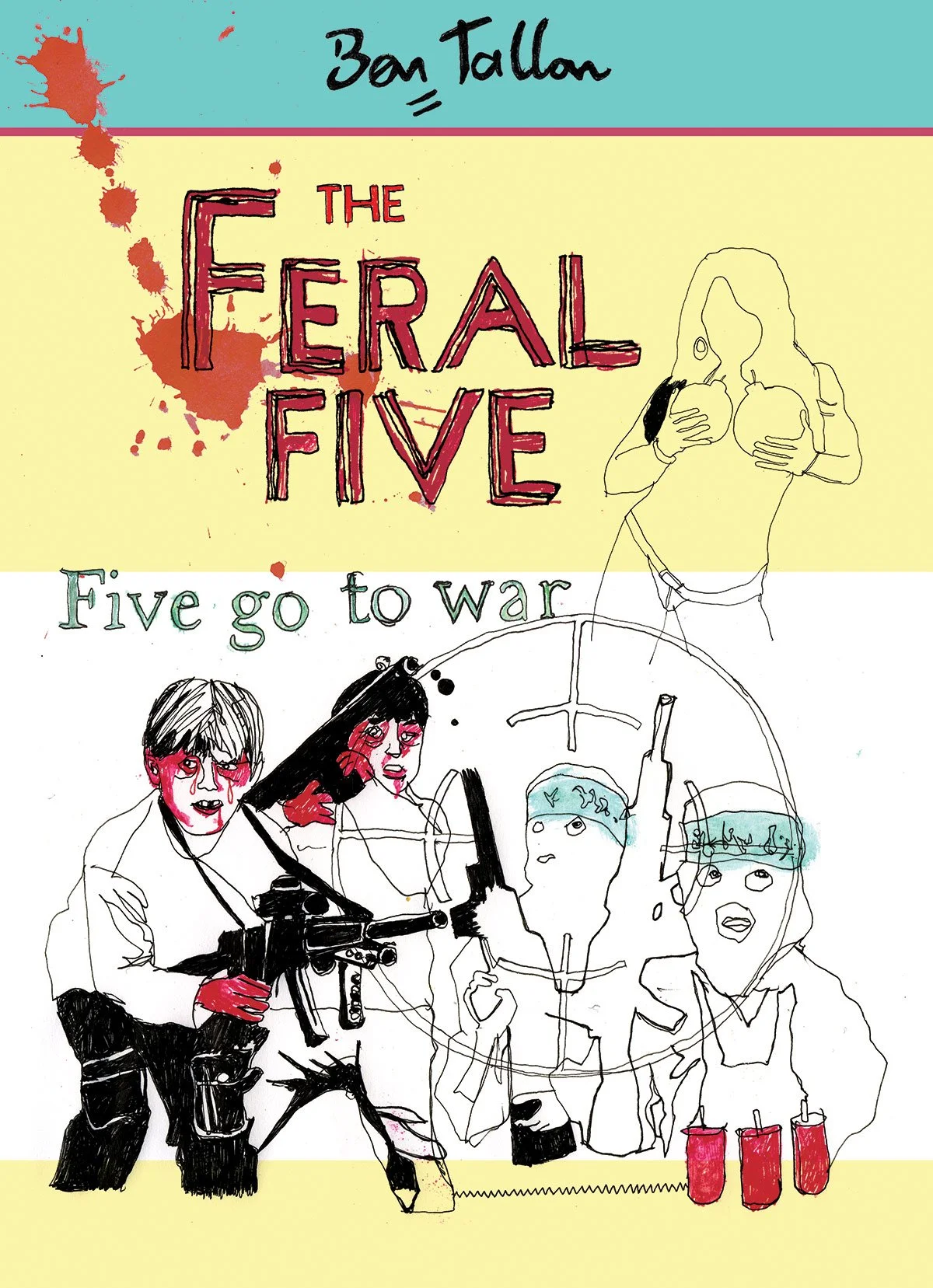
I don’t know whether this is horrific, thought-provoking, or what. I remember it was a comment piece about the stolen innocence of child soldiers, and I wanted to juxtapose this tragedy with the magic and mystery I felt when reading Enid Blyton’s The Secret Seven books as a child. I like the drawing. Obviously, the graphic design is not my specialism, so that leaves a lot to be desired. Another piece that I’d absolutely second-guess today, but that just didn’t enter my thinking back in 2008.
13. Dog Sniff
I came close to having this tattooed on my arse. Utterly silly, a piece of work created to make people laugh. No more, no less. Hmmm…
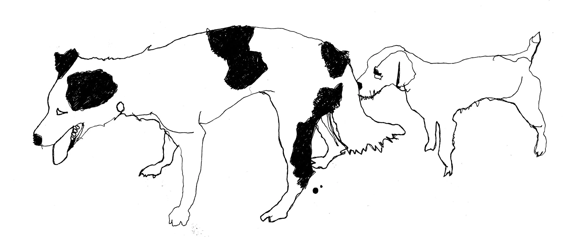
14. The Overbreeders
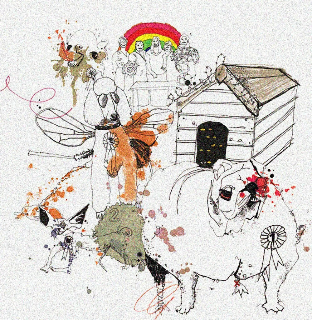
As a big animal lover, I’d been rankled by something I read about the cruelty of the overbreeding of certain dogs for the aesthetic merits desired by certain dog shows, and created these mutant hounds in response. Another talking point, another expression of my youthful hunger to contribute to meaningful causes.
15. Excluding Shipping
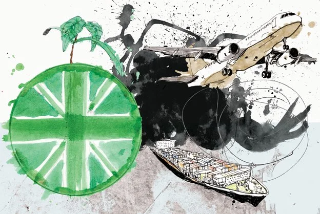
Another speculative editorial illustration about the overlooked but massive emissions role of shipping. So much emotion in this portfolio! I’d most definitely encourage someone in the same shoes to broaden their remit here, to balance more, but it worked – devil’s advocate would say that this emotion drove my stylistic and technical development, so perhaps I was right after all… there’s no right answer here.
16. Kids Go Bad
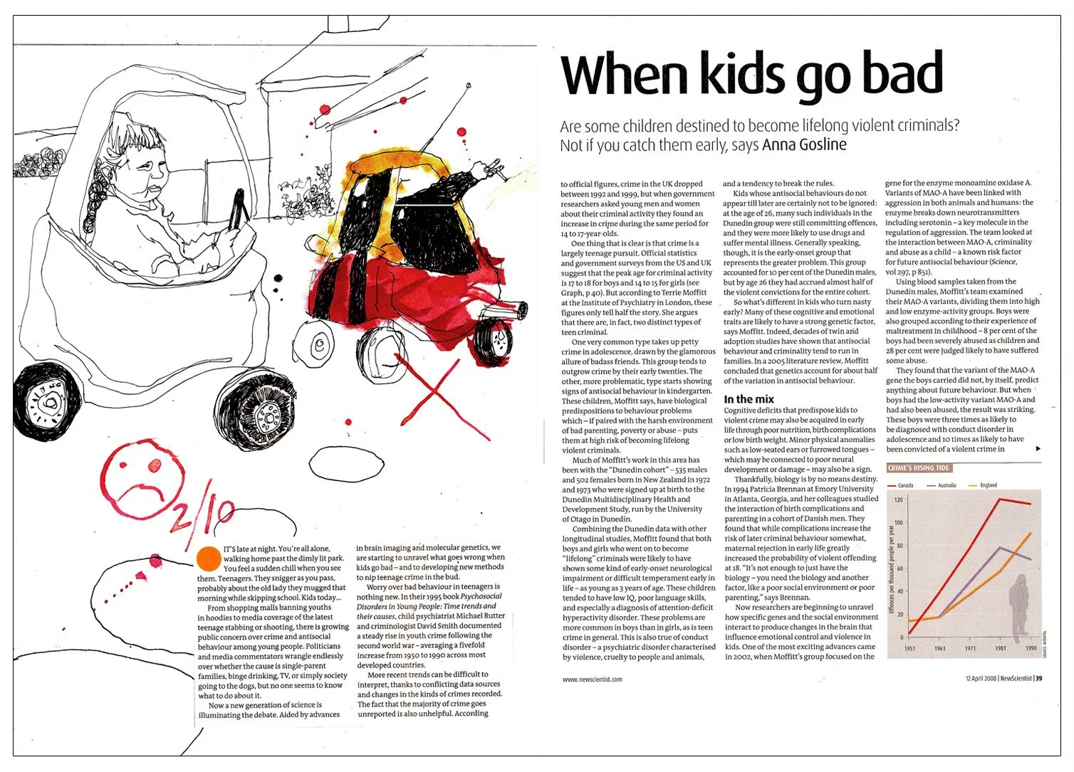
A self-initiated response to an article exploring whether some children are destined to become criminals. I still love this. Occasionally, I’d strike the right balance of good observation, humour, and technical execution. I believe this was one of my more successful early works. What shines in my portfolio is positioning. I knew my strengths and showed unlimited courage in expressing my intentions, even if there was a lot of refining to be done.
17. Kidneys on eBay
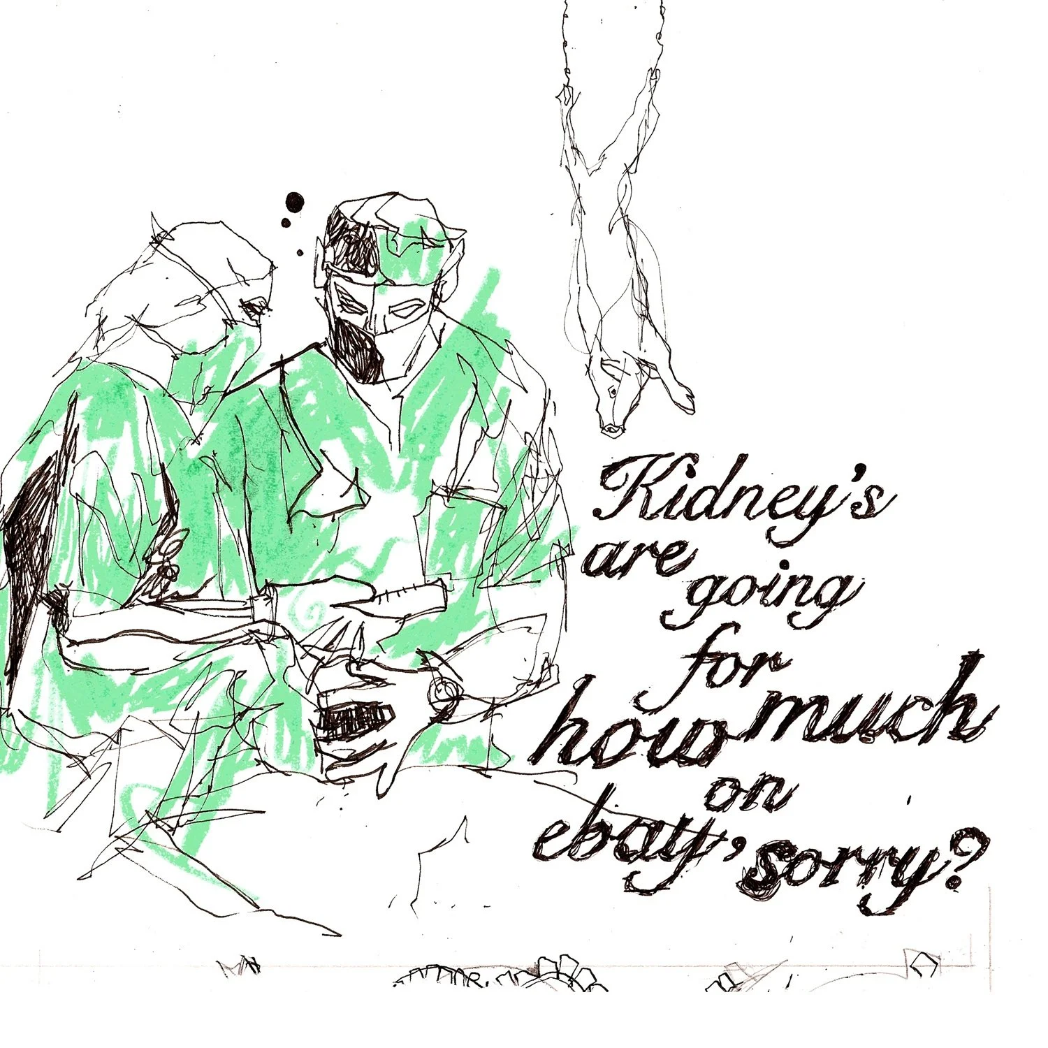
A strange and unfathomable piece that I remember including simply because I loved the line work and the colour. This would never have made the cut under the stewardship of me today, but youth must come with the freedom to make a mistakes and embarrassment, within reason. That’s the tragedy of cancel culture, isn’t it?
18. Scout Sex
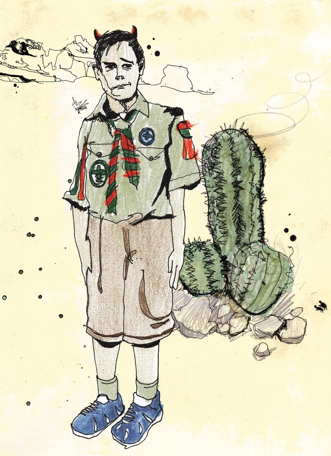
Editorial mock-up. I have no idea what the article was about. What you see is what you get here.
19. The Race v Sex Challenge.
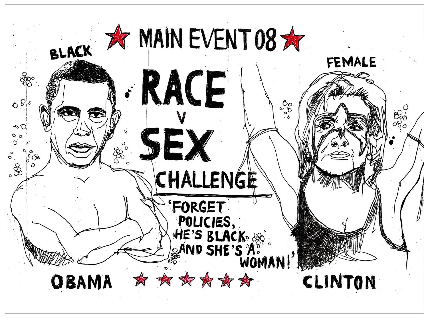
This, arriving at the mind-point of ‘The Versus Series’, perhaps over any of the other images in my maiden portfolio, got me noticed. Political comment expressing my yearning for more policy insights over the fact that Hilary would be the first female president, and Barack would be the first black president. With hindsight, I better understand the magnitude of these two firsts, and there probably was a lot of information about policies, but it was how I felt back then, and I found it interesting. The balance of hand lettering and imagery was of particular interest to many early art directors who gave me chances and helped me to develop. I would eventually launch my standalone hand lettering brand, ‘Tallon Type, ’ thanks to one in particular.
In Summary
This was a wild ride for me. I’m shocked at how raucous and passionate this portfolio really was, but delighted to see how that worked for me. Despite some clumsiness and naivety, both technically and tonally, I’d truly set out my stall. Inspired by graphic activism and focused on breaking into the editorial market, I held nothing back, which fast-tracked me past pleasantries and into strong bonds with art directors, creative directors, editors, journalists, and designers who knew how to shape this raw material. I benefitted from their experience and grew (a little) in maturity and artistic competence. During a recent coaching session, my client told me they feared making certain work with this emotional punch because the industry might see them as someone who might rock the boat. I understood this concern, given the changes in the world since 2008, but the creative industry today is crying out for personality and storytelling. I would go further and suggest that in the age of rapidly improving AI, work without a story and personality is the most likely to go first. But remember, this was me. You are you. How you go about building your portfolio is personal and must always rest upon foundations shaped by what is right for who you truly are.